Considering converting a color image to black-and-white: the what, when, why, and also how
Color or black-and-white? That is the question.
So, what is it gonna be? When and why should we consider converting an image, a color image, to black-and-white?
Certain visual stories are best told in color, while others in black and white. To learn more about black-and-white photography, check out this article published in Moment Precise Photography magazine.
But back to the question at the top of this post: how do we decide when or if to convert a color image to black-and-white? What’s the thought process behind this decision? Is it the subject matter, the story that we want to tell, the mood it evokes, or the mood it evokes to us and that we want to share with the viewership?
To help you decide, here are a few things to consider:
- your client, audience, purpose, or goal: what do you want to achieve by photographing a particular subject or story
This might not be the most obvious starting point, but I believe it’s an important one nonetheless. When photographing for a client–a business, publication, or individual–we need to make sure that the images we create follow the guidelines and requirements given by the client. In other words, we need to make sure that we please the client.
Newspapers often print images in black-and-white, but also in color. Hence, when photographing for newspapers, before submitting, it would be a good idea to at least compare how the color image would look in black-and-white images.
Other examples would be travel publications and fine art photography projects. A travel magazine would usually publish color images–for example golden hour images of landscapes or seascapes. Color is often important when photographing for travel magazines. That’s not to say that they do not ever publish black-and-white images.
We can convert a travel color photograph to black-and-white, adjusting the colors in the black-and-white filter to create a b&w photograph that would be displayed on the walls of a gallery or become part of a portfolio. We know that highlights reveal and shadows conceal. In black-and-white, shadows can do an even better job concealing certain details otherwise visible in color. Hence, black-and-white enhances a dramatic component, telling the visual story in a more dramatic, perhaps thrilling way. We need to choose the best and most powerful way to tell the visual story–color or black-and-white.
Let’s look at a few examples.
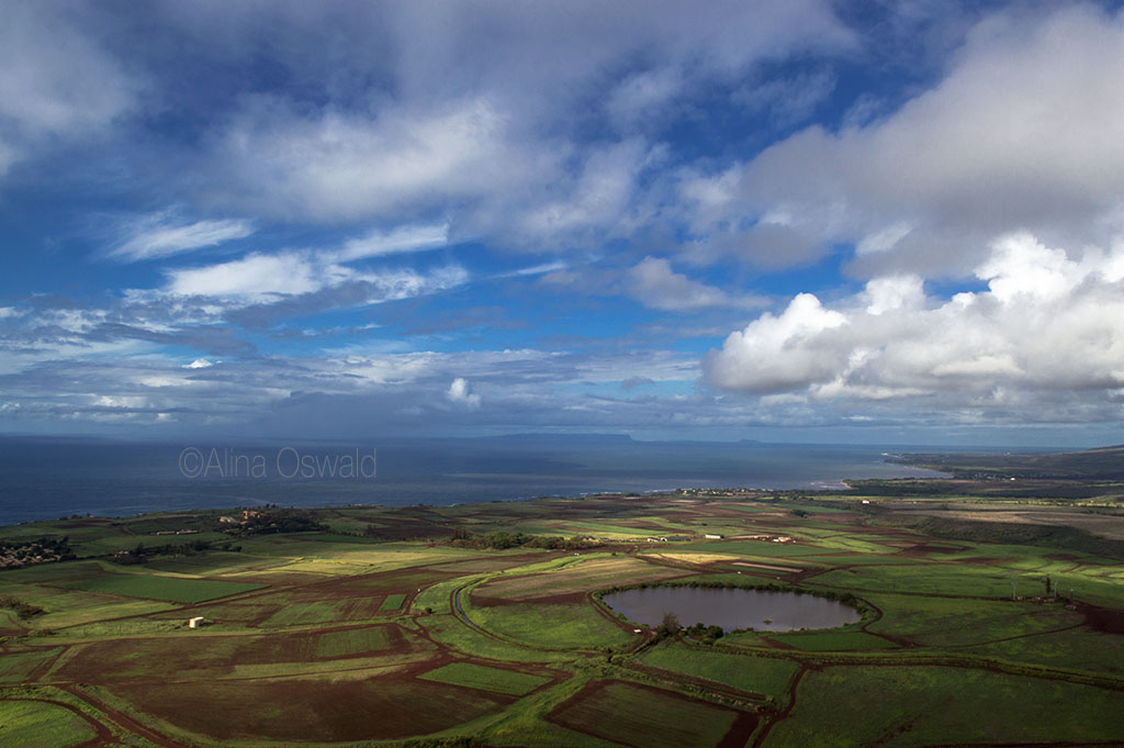
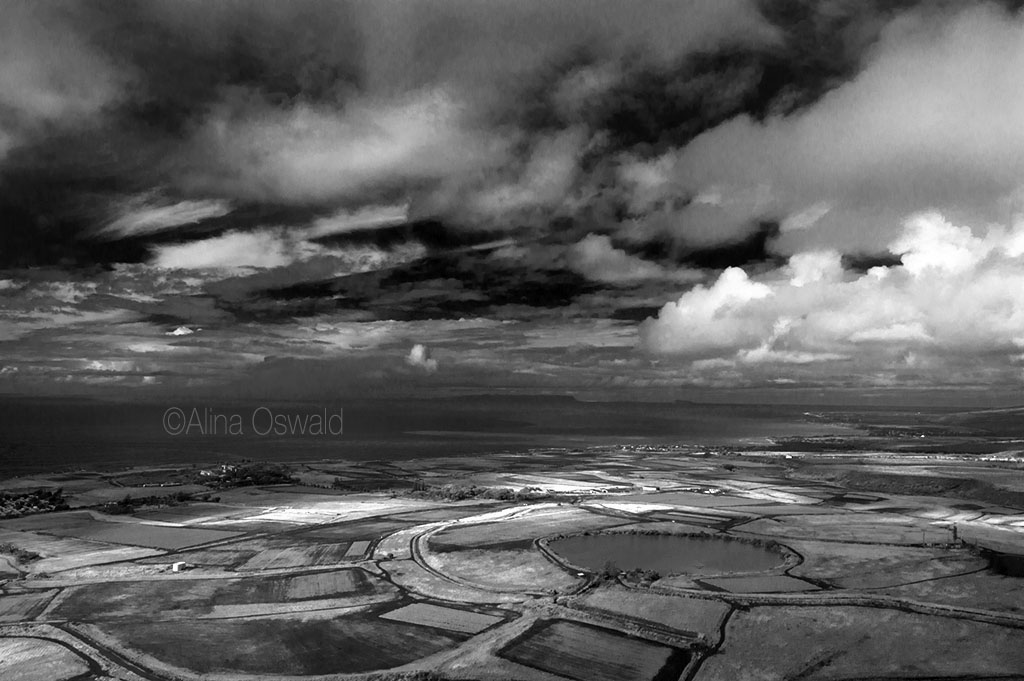
Here’s a Hawaii aerial image displayed in color, as well as in black-and-white.
The blue skies are inviting, in the color image. The dark skies in the b&w image add an edge to the story and dare us to take a closer look perhaps. Do they welcome us as we fly through or do they threaten us? Do they consider us friends or foes?
The color image would work best published in a Hawaii coffee table book or in a travel or Hawaii-related magazine, for example. The black-and-white image perhaps tells a familiar story (of a landscape we usually associate with color) in a different way. Hence, it might be included in a black-and-white landscape photography portfolio or as part of a photography show.
Another example would be images of buildings and cityscapes.
If submitting to publications, and this is a general comment, make sure that you research that publication first, check out multiple past issues and the current issue, and understand what the editor is looking for–what type of images, the mixture of color and black-and-white (magazines use both), and so on.
- subject matter and story: you decide how it’s best to present the subject and/or tell the story, in order to tell the most powerful, most interesting and intriguing visual story possible and keep the audience engaged
When choosing how to tell the visual story–in color or in black-and-white–you have to use your own gut, but also take into consideration the client’s needs, assuming that you photograph for a particular client.
When photographing for your own portfolio, you have the final word, but even then you have to remember the goal of making that image and what you want to achieve by making that image, capturing that moment in time.
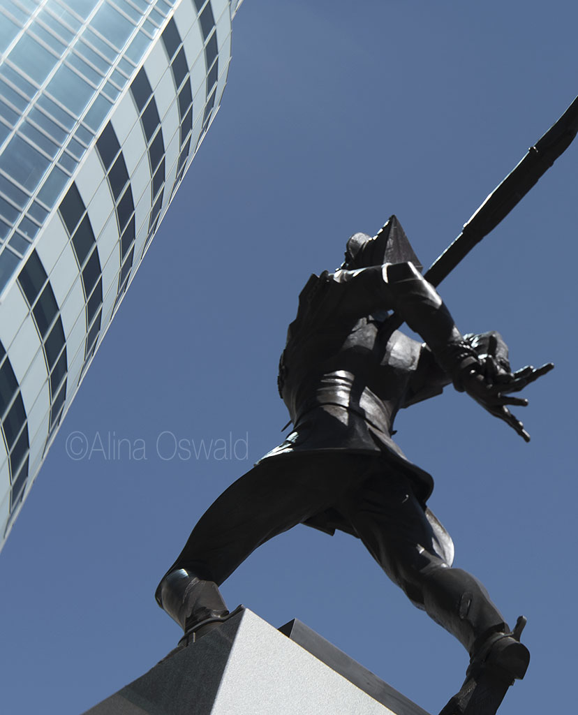
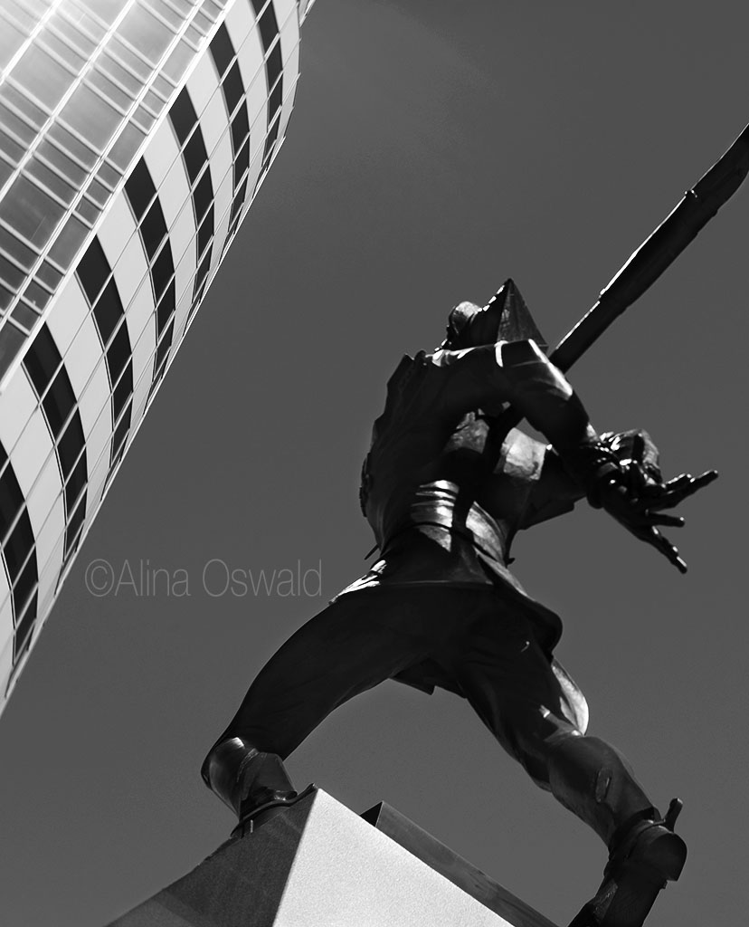
Not long ago I had the opportunity to test out a Lensbaby Velvet 65mm. I had an excuse to walk around, camera in hand, and take pictures of subjects that I found interesting along the way.
Here is an image from that photo walk. It’s an image of the Katyn Soldier memorial, on the Jersey City waterfront. Because of the subject matter, I’d choose the black-and-white image over the color one. That’s because, again, black-and-white enhances the dramatic element in an image, making viewers connect even more with that element (in this case, the Katyn massacre during WWII). In addition, black-and-white in this case touches on, reminds of subjects that used to be alive, adding a hint of ‘in memoriam’ feeling.
To perhaps make it easier to understand how to decide between color and black-and-white: telling the visual story in color or in black and white has to do with telling the story in a particular voice. I’m not talking about point of view, but rather the voice that would read that story to us.
Think about it this way, when converting books to audiobooks, producers need to choose the right actor with the right voice to read and record a particular story. A Stephen King thriller would be best read (for an audiobook) in a male, baritone voice, one that resonates with a certain mood evoked in the story. Twilight by Stephanie Meyer might be best recorded in a younger female voice. And so on.
Long story short, we have to match the voice that we ‘hear’ in our head when reading the book with the story and its subject. To achieve that in visual storytelling, we can use color or b&w.
And now let’s look at a few portraits.
Here is an image from a recent fitness studio photo shoot, posted in color as well as in black and white. The color image would be more suitable for a fitness magazine covering international athletes, bodybuilders, or international competitions–hence the German flag colors. (German flag colors just happened, because of the colors in the outfit.)
Sunglasses work best, I think, in the black-and-white image, adding to the edginess often associated with black-and-white, and also with the subject and story told in b&w.


- sometimes, color and black-and-white offer only subtle differences
Below is another image from a recent photo shoot. The transition from color (left) to black-and-white (right) is quite subtle, I think. Still, the black-and-white image is a hint more dramatic, more intriguing. Rule of thumb: If you submit to a b&w photography contest or to a b&w portrait portfolio, by all means, choose the b&w image. But otherwise, the choice is all yours.
Sometimes on-location portraits could look good in both color and black and white. Again, it depends on the particular mood you want to evoke through the photograph, and the elements you want to emphasize.
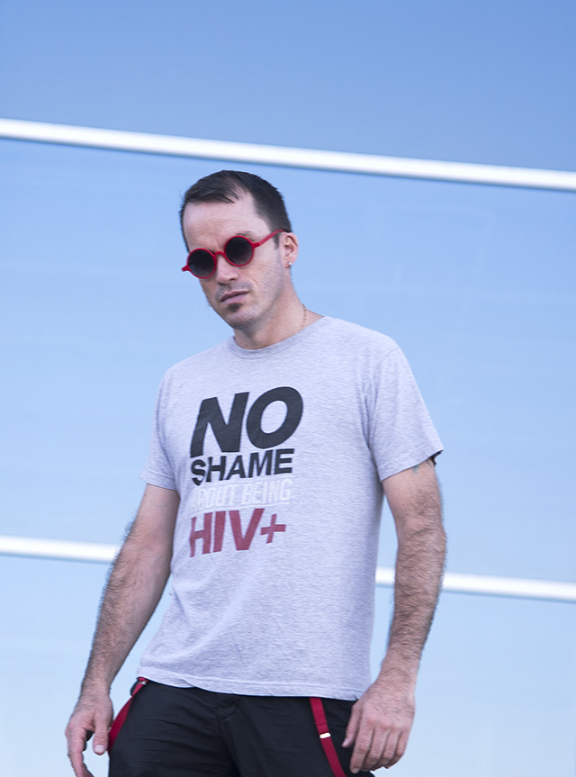
The images posted below are part of a photo shoot (and interview) with actor and activist Rob Ordonez for A&U Magazine–America’s AIDS Magazine. The No Shame HIV+ t-shirt advocates against HIV-related stigma. The sunglasses frame matches the red in the t-shirt. The blue sky represents hope (hope that stigma will be over, hope that a cure will be discovered, etc) and also something that Ordonez talks about in the interview.
That said, the black-and-white image has more ‘teeth’ as they say. It better highlights the determination of HIV advocates, as well as the seriousness with which we all should be treating the epidemic and everything related to it, including stigma.
Therefore, for the article, the color image would work better. For an HIV education campaign, perhaps the black-and-white image would have a more powerful impact.

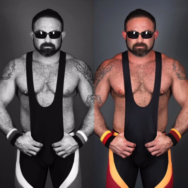
And here it’s an image of yours truly, in summer (and tan) colors, as well as in black-and-white.
The pose and facial expression work better, I think, in the b&w image. Color makes the subject more…approachable. (No worries, I’m mostly a people person or at least that’s what I’ve been told :-))


So, to summarize:
Consider the following, before converting an image to b&w:
- the subject matter
- the visual story
- the best way to present the subject and/or tell that visual story based on the audience, goal, or purpose; based on what we ultimately want to achieve by making that image and sharing it with the world
Also keep in mind, when trying to decide between color and black-and-white:
- adjusting the colors in the black-and-white filter helps us emphasize certain parts of the image
- color and black-and-white help us tell the same story in different ways. Sometimes color reveals more details than black-and-white. Choose wisely!
Ultimately, especially when working on your own portfolio, it is up to you, the photographer, the creative, to decide. When making that decision, remember what compelled you to make that image and immortalize that moment in time, in the first place.
As always, thank you for stopping by!


Leave a reply to Knut Arne Gjertsen Photography Cancel reply